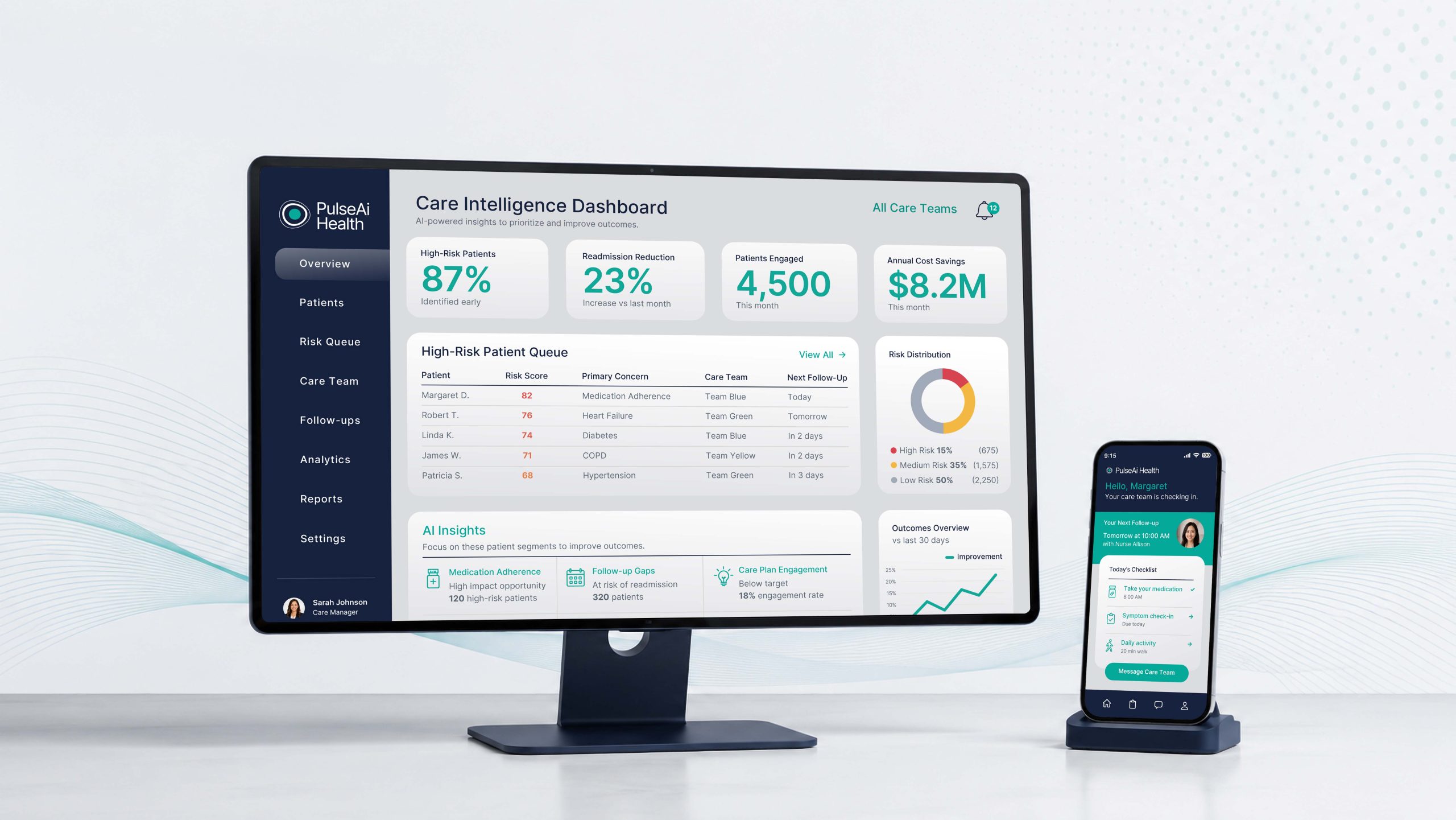
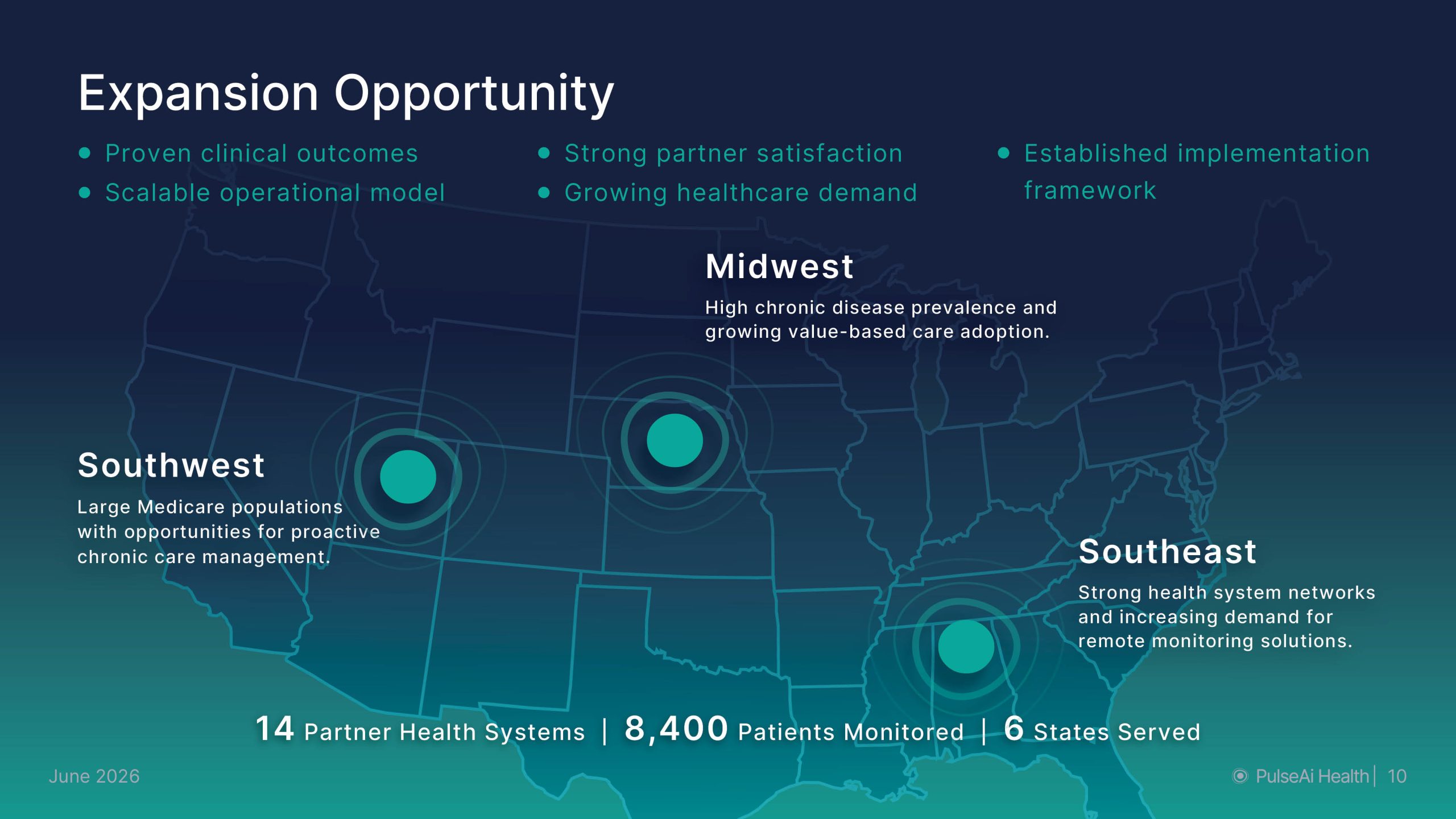
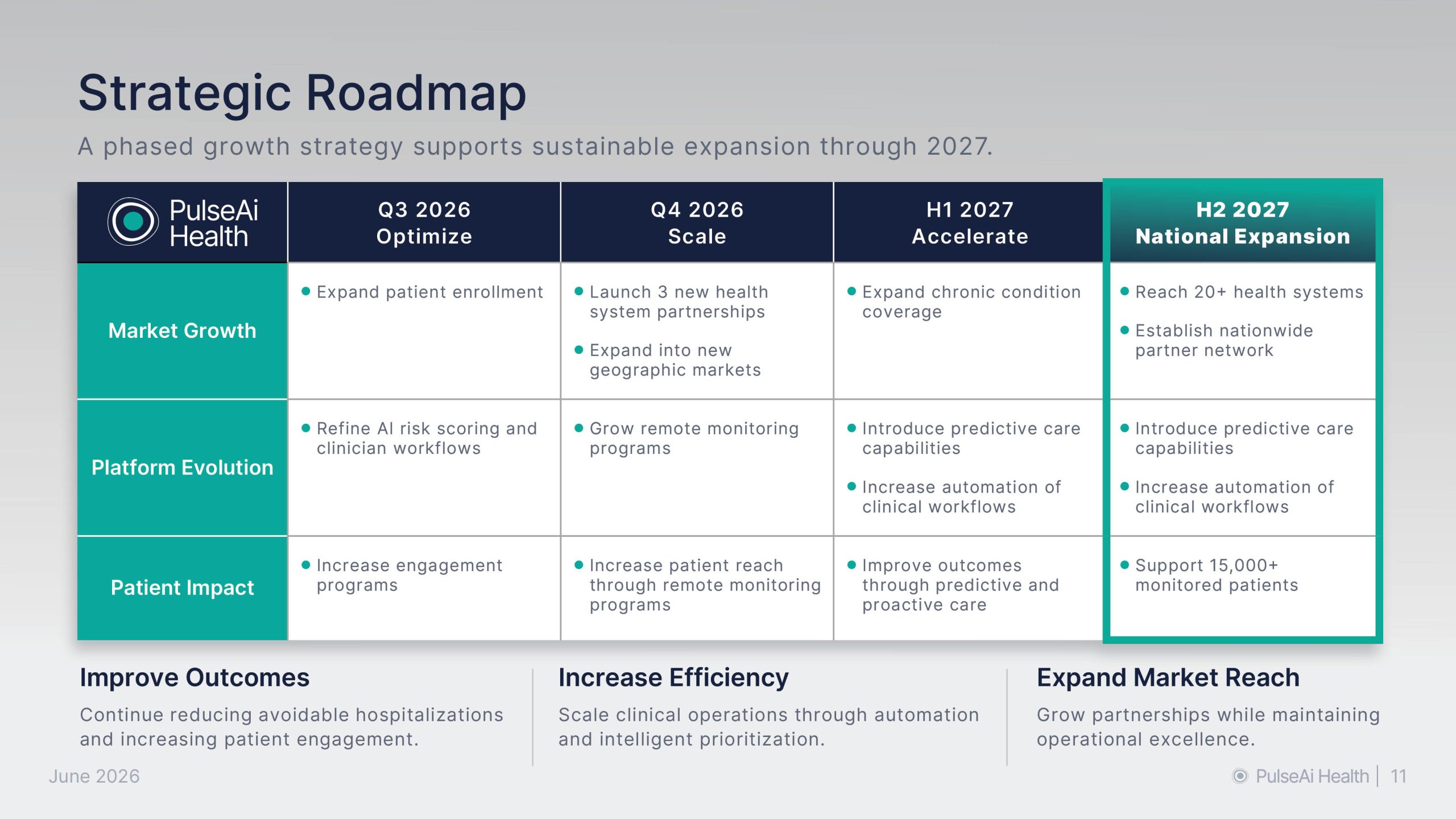
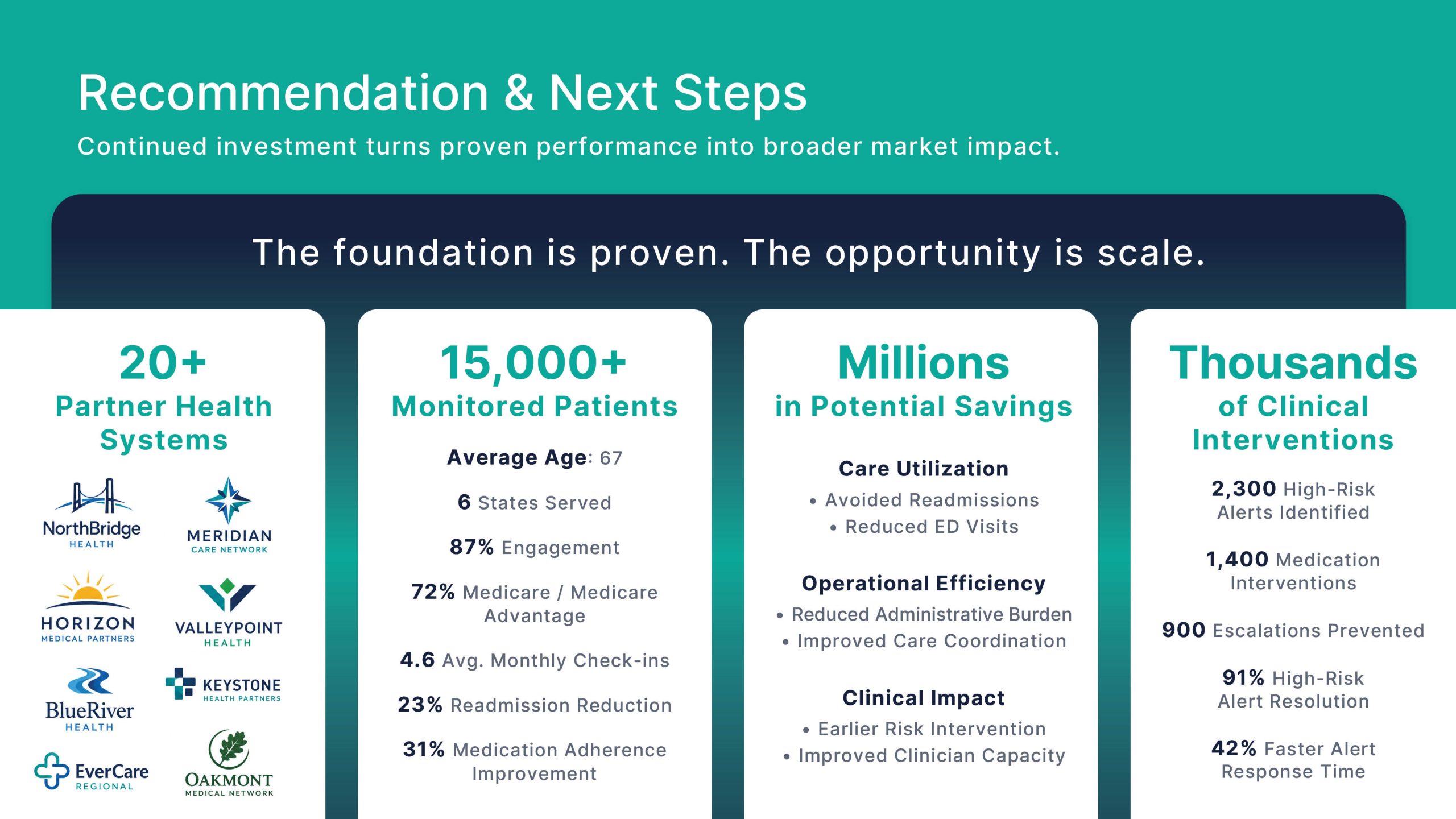
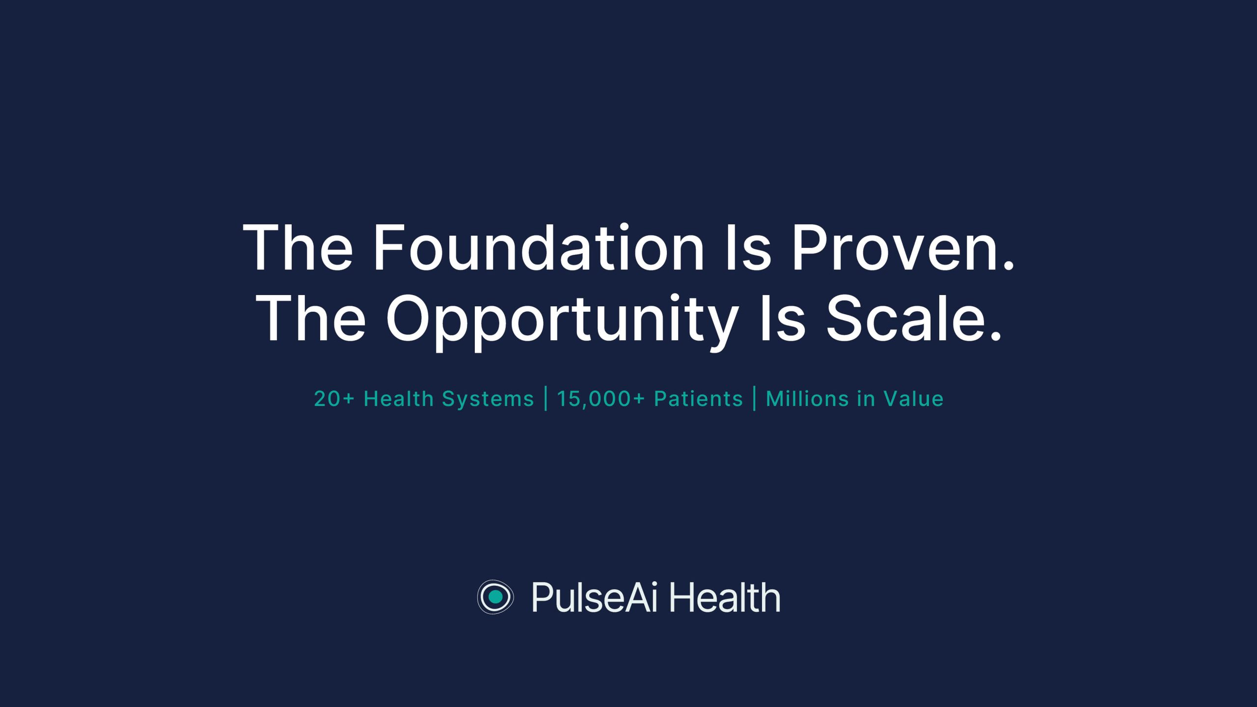
PulseAi Health is a conceptual healthcare technology brand focused on helping care teams identify patient risk earlier, prioritize outreach, and improve chronic care outcomes.
The project explores how complex clinical, operational, and financial data can be translated into a clear executive-facing brand experience.
My Role
My role focused on building a cohesive visual system across brand identity, presentation design, data visualization, website design, and supporting mockups.
I developed the visual direction, presentation structure, chart styling, typography, icon system, image direction, and final case study presentation.
Project Type: Healthcare Technology Brand Concept
Role: Graphic Designer / Presentation Designer / Web Designer
Scope: Brand identity, executive presentation deck, website homepage, data visualization, icon system, photography direction, and portfolio mockups
Tools: Adobe Illustrator, Photoshop, InDesign, After Effects
Brand Identity
The PulseAi Health brand identity was designed to feel clean, clinical, organic, and straightforward. Rather than using the expected pulse-line symbol, I created a more ownable logo mark with subtle organic stroke variations that suggest movement, humanity, and a pulse-like rhythm even in still form.
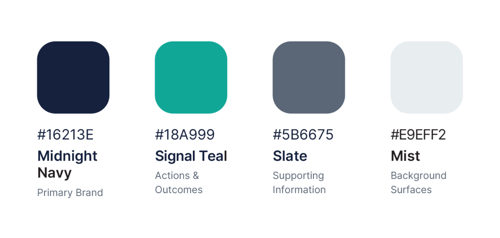
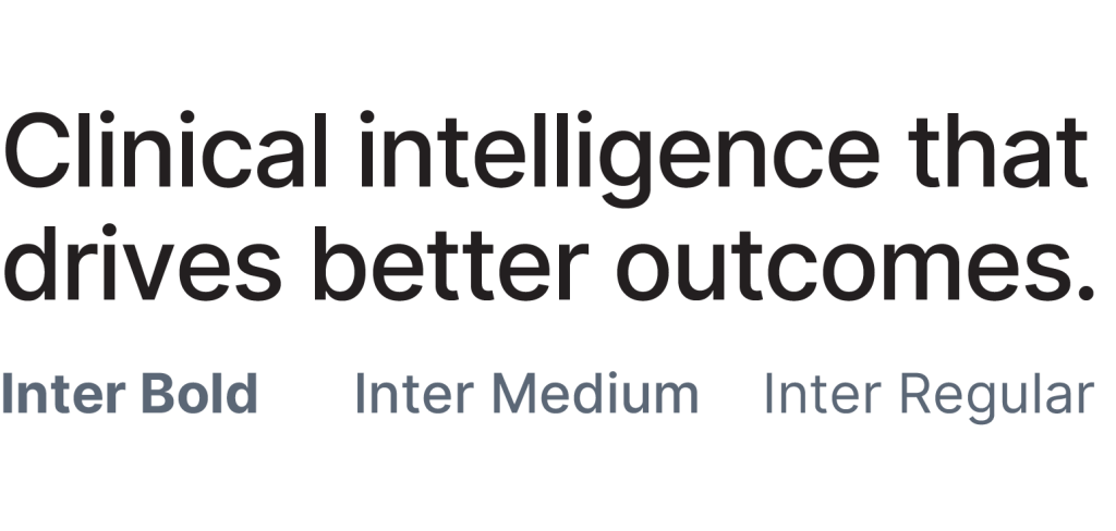
The teal palette reinforces ideas of growth, health, and innovation, while the clean typography system helps complex healthcare information feel organized, accessible, and easy to navigate.
The PulseAi icon set was designed to feel closely connected to the logo while still functioning as its own visual system. Each icon uses more detail, but keeps the teal dot and organic line-work as consistent brand cues. The result is a cohesive icon family that feels recognizable, functional, and aligned with the overall identity.
Data Visualization System
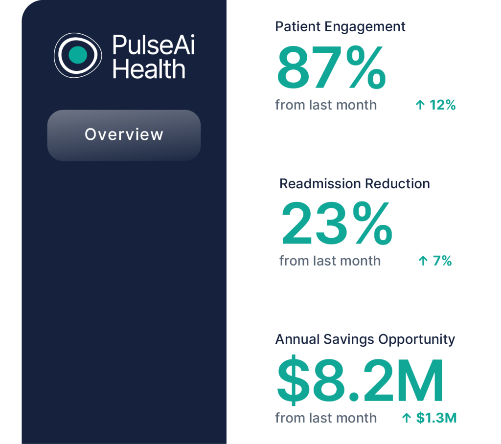
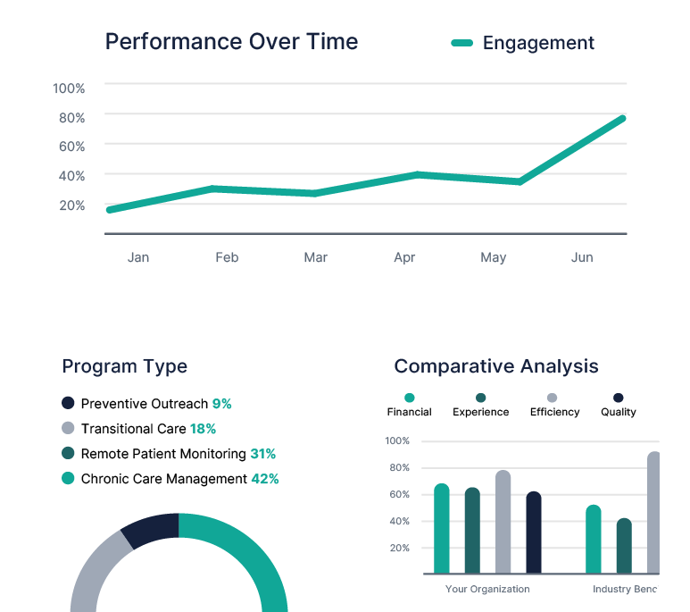
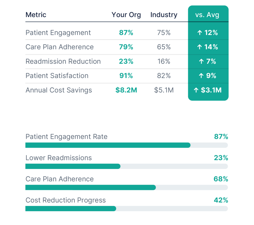
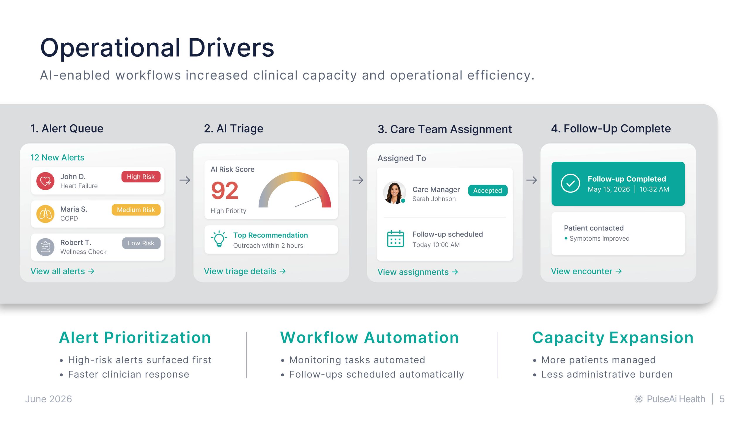
Signal Teal guides the viewer’s eye to key information quickly, while risk-based color coding makes the data easier to scan and understand. Rounded chart elements subtly echo the logo shape, creating a cohesive visual system that feels branded, intuitive, and efficient.
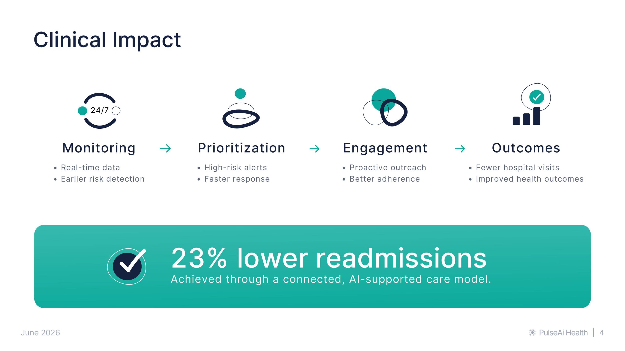
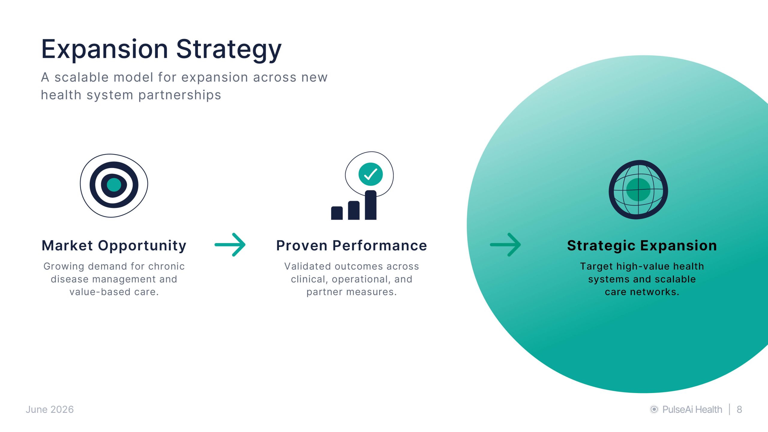
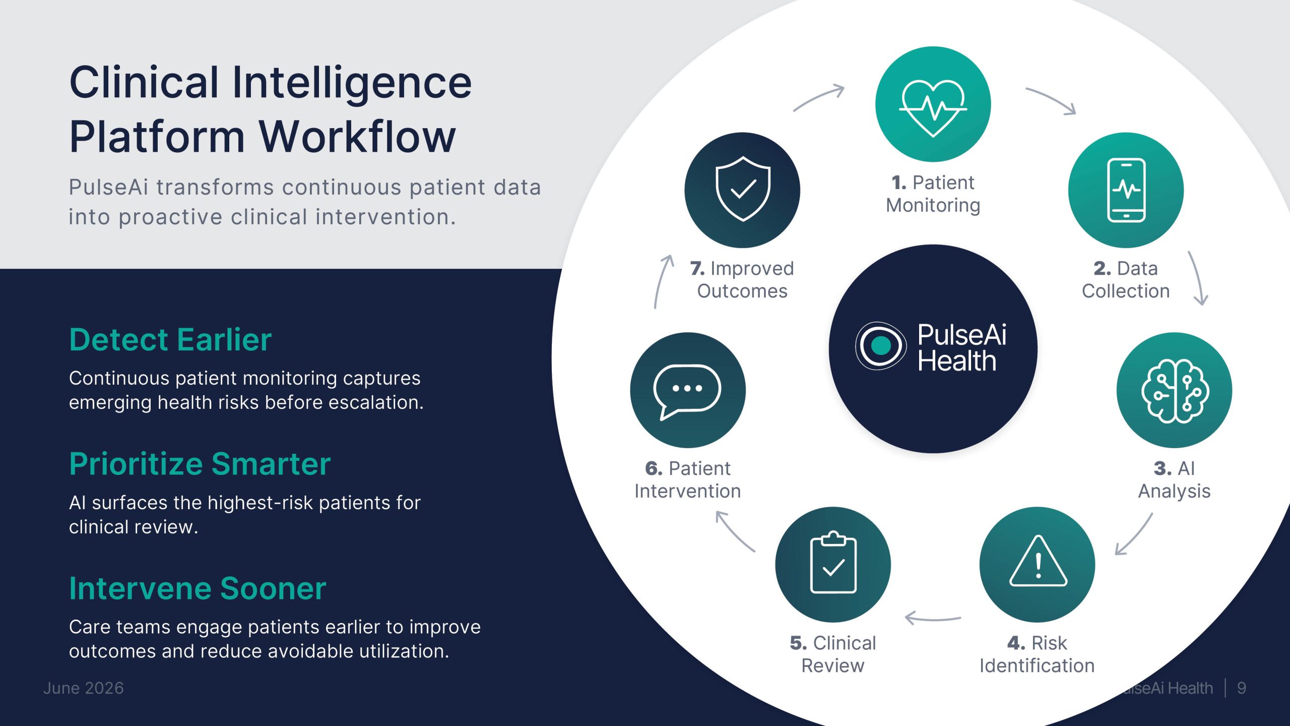
Executive Presentation Design
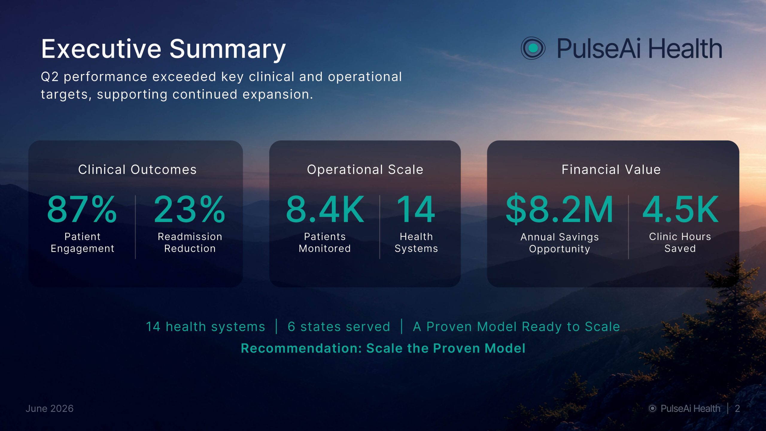
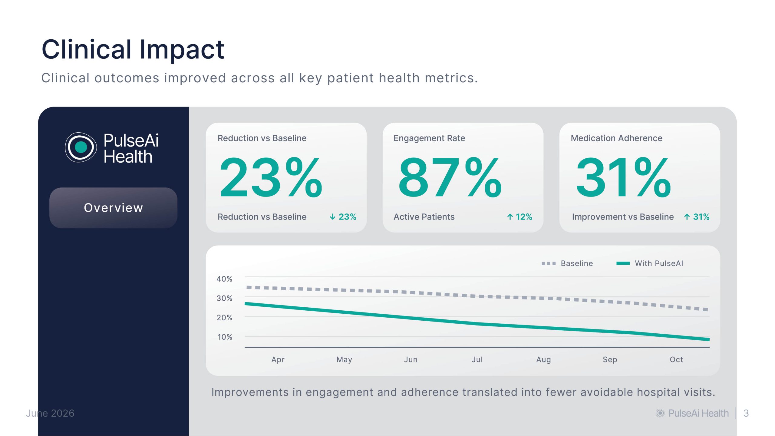
Data-heavy presentations need more than polished slides. They need structure, hierarchy, and a clear point of view. I design presentations that condense complex information, support the speaker’s message, and make the main ideas easy for the audience to understand.